Digital Signage Network
Usability Testing, UX, Prototyping, UI

Summary
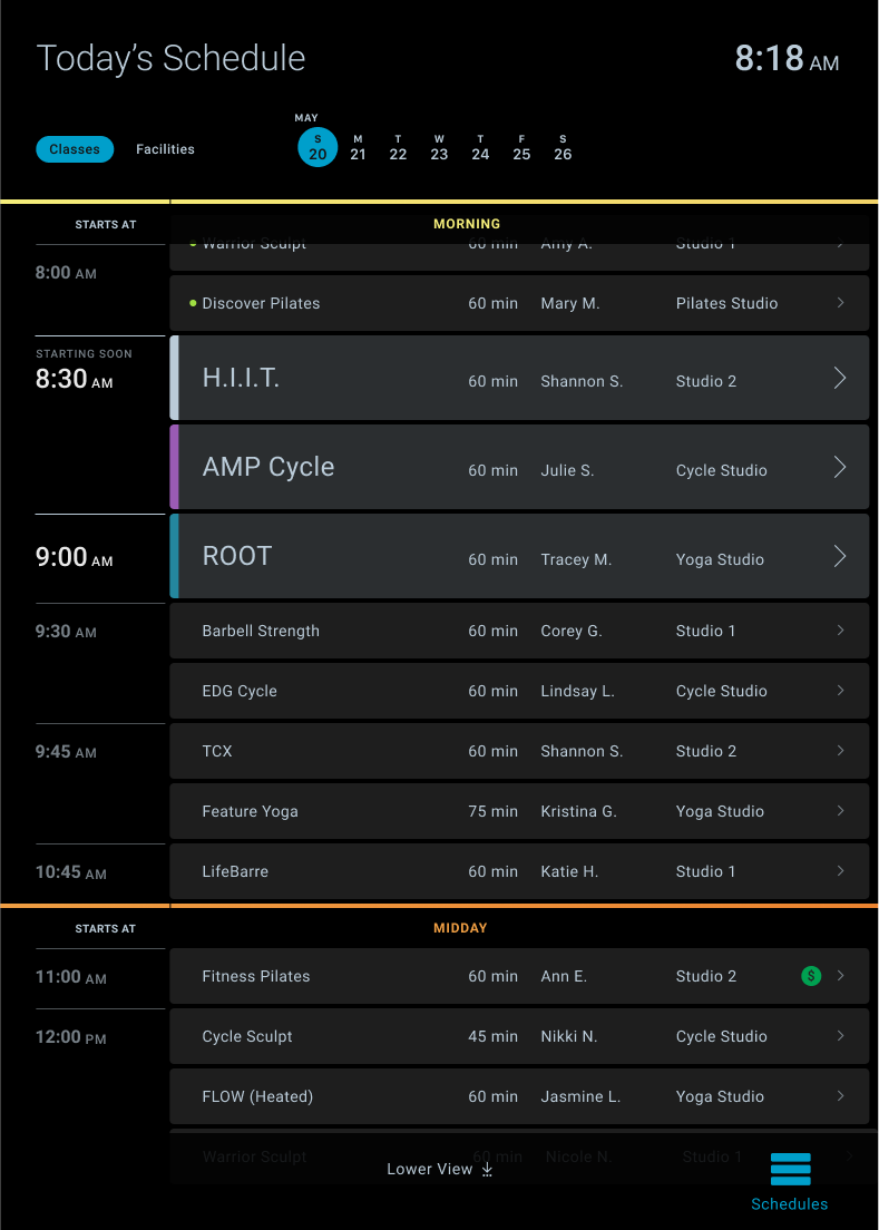
- In-club experience for interactive schedules on kiosks, large displays and timed video pillar.
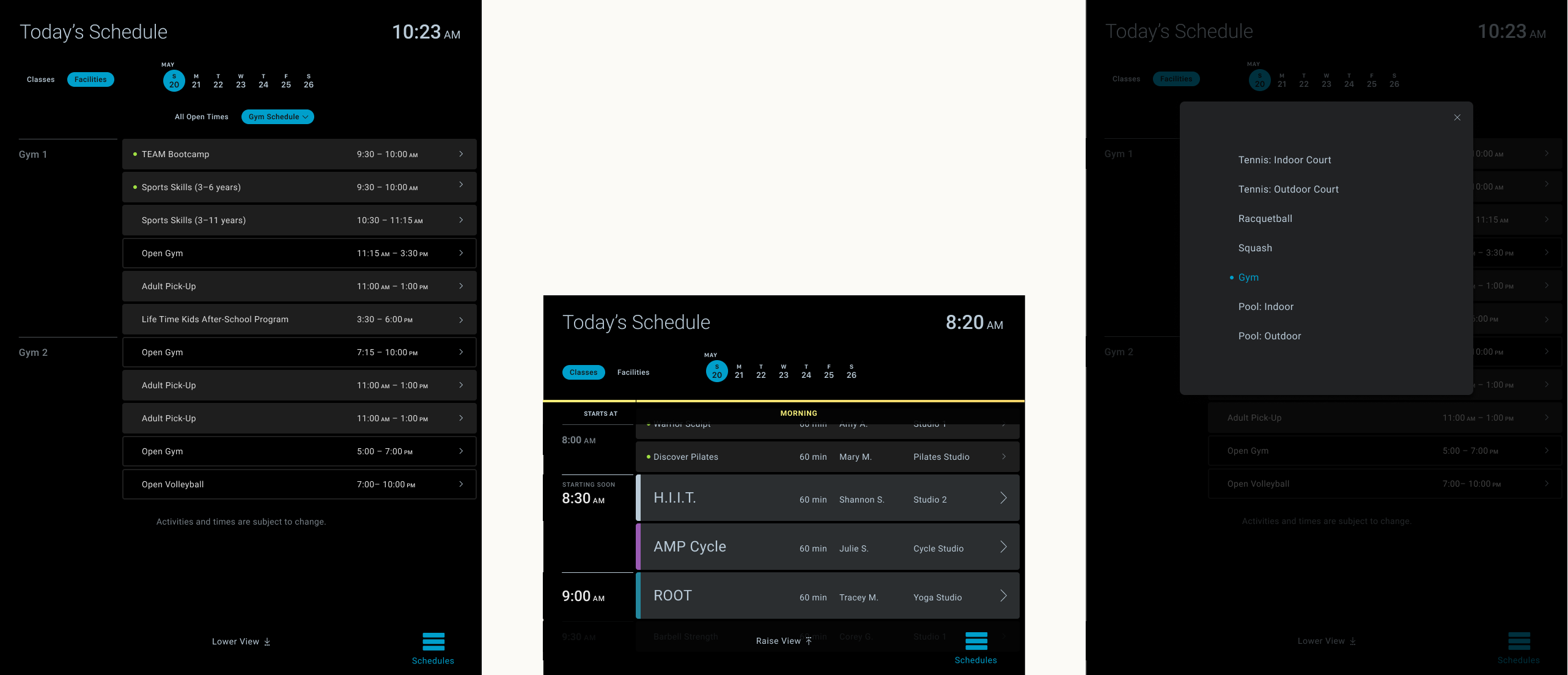
- Modern UI highlights current and upcoming classes, provides full class and facility schedules, and links to details about each instance.
- Design that works just as well on a kiosk with touch interaction, as it does ten feet up as static data.
Background
Schedules are a massive touchpoint for Life Time. With hundreds of classes and activities happening weekly at each club, paper schedules posted near doorways just don’t cut it. Enter the digital signage network, or DSN for short. With everything from GM bios to advertising, and brand messaging to events DSN helps to entertain and inform members in the club.
When it comes to club schedules, there’s an aspect of wayfinding to it, a little bit of planning, and a lot of assurance that you’re in the right place. Life Time facilities are large and luxurious, strategically placed displays help members confidently plan and participate in the day’s activities.

Objective
Provide current schedules that can easily be consumed actively and passively as users move throughout the club. The design should feel integrated with the high-end space, while also standing out enough to invite personal interaction.

Method
As a precursor to this project I worked on revamping schedules for Life Time’s member website. Through prototypes and moderated usability testing I landed on set of UI patterns that aligned with how users navigate and consume schedules, along with aesthetics that support that usage. With a shorter development cycle than web, DSN has been able to release the design sooner.

This wasn’t the first version of schedules on DSN, but the previous one had usability issues and lacked parity with our other digital channels. To our benefit though this gave us a platform on which we could quickly prototype and finesse the final product.
Given the fact that the same UI would need to scale from a mid-sized kiosk screen to an elevated multi-panel display, I worked on several exercises to ensure that the interface was malleable enough to support legibility and the different interaction modalities as it scaled.


Outcomes
Users are able to contextually consume schedule information. The in-club schedules experience feels more connected to our online experiences, both in form and function. Most importantly, members experience a clean interface that simply lets them know what’s going on when, helping them get on with their day.
