Core Design System
Pattern Lab, Sketch UI, Front-end Development, Documentation

Summary
- Static Photoshop and PDF files transformed into a dynamic design system complete with a development framework, Sketch UI library, documentation, and guidelines with several regular contributors.
- The Core Design System serves multiple web properties, supports external teams, and encouraged sibling systems for channels like mobile and email.
- The inertia around the system has given a voice to accessibility efforts and inspired the creation of enterprise design principles.
Background
Like many design system stories, this one also started by doing things that didn’t scale. Things like maintaining styles and patterns in Photoshop and PDFs while storing them on internal servers where updates can be tedious and sharing wearisome. To the few of us doing the collecting, curating and sharing the evergreen nature of the effort was energizing and laid a great foundation to build on.
Objective
Scale the resources and reach of Life Time’s digital design and development assets. To that end we wanted to stand up a dynamic website to display and document existing styles and patterns with semantic markup while creating a playground for exploration. We also wanted to include a starter kit of sorts for both designers and developers.
Method
We knew we needed lightweight, low barrier solution that was framework agnostic and included documentation inline. Around this same time Pattern Lab(external link) was gaining traction, fueled by Brad Frost’s Atomic Design(external link) principles. I was familiar with it from other projects and knew it’d be a good place to start.
We stood up the site using Pattern Lab, and started documenting our styles and patterns in an atomic structure and then set it behind employee credentials, created a simple build process and maintained it within a shared repo. When applicable we also added elements to a master Sketch UI library.
Referencing the site and Sketch assets as the source of truth for patterns creation and use was critical for everyone from business partners and designers to developers and QA to build trust in the system.
Outcomes
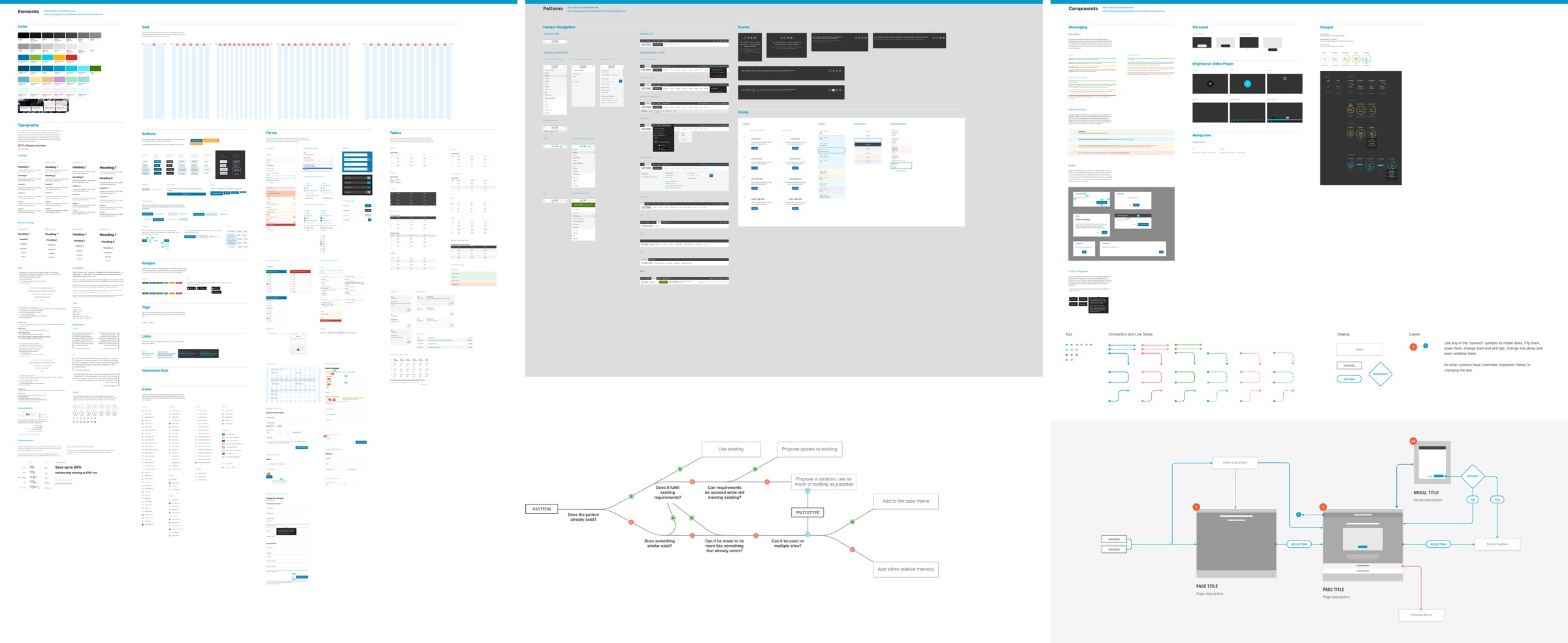
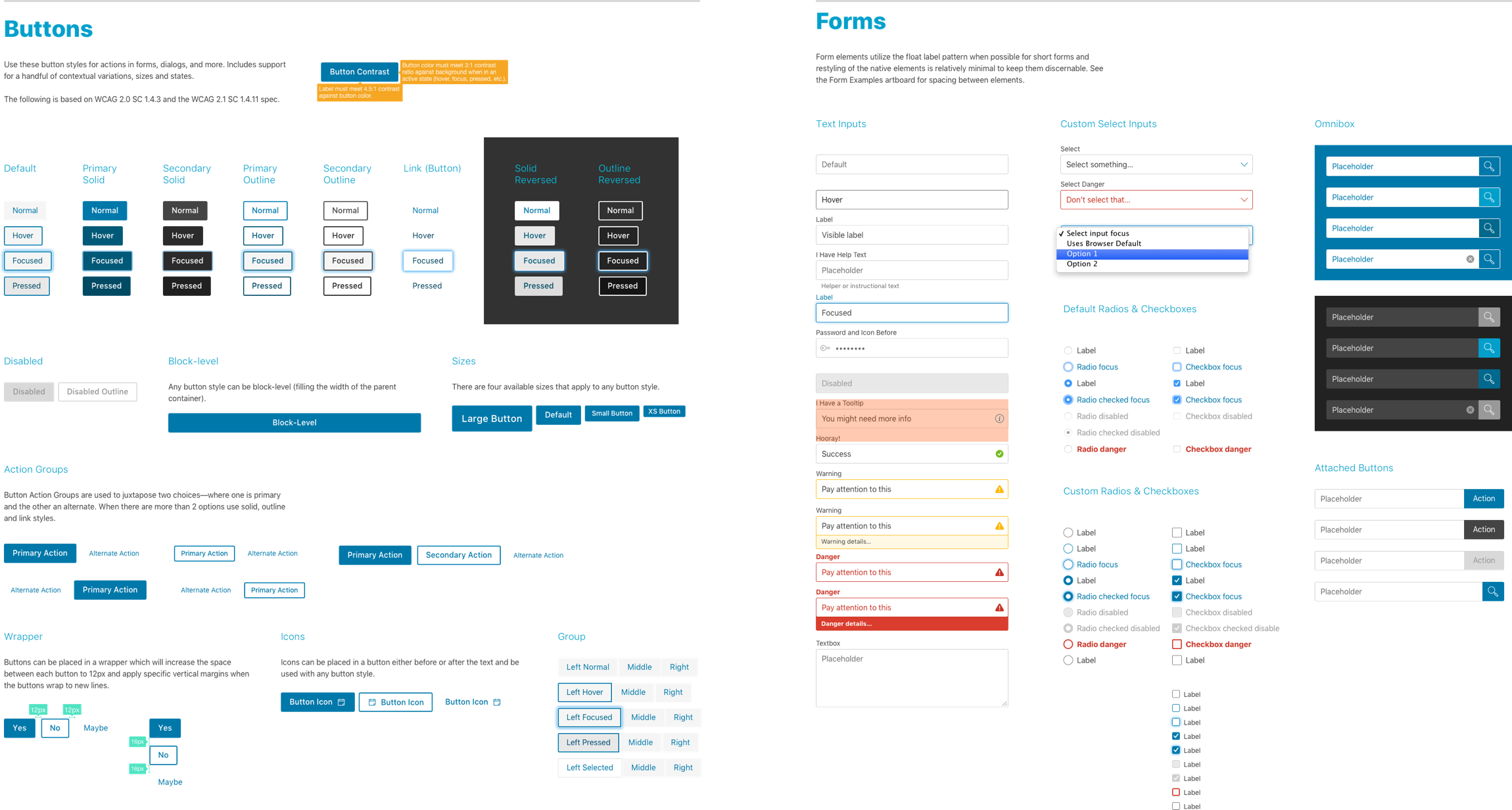
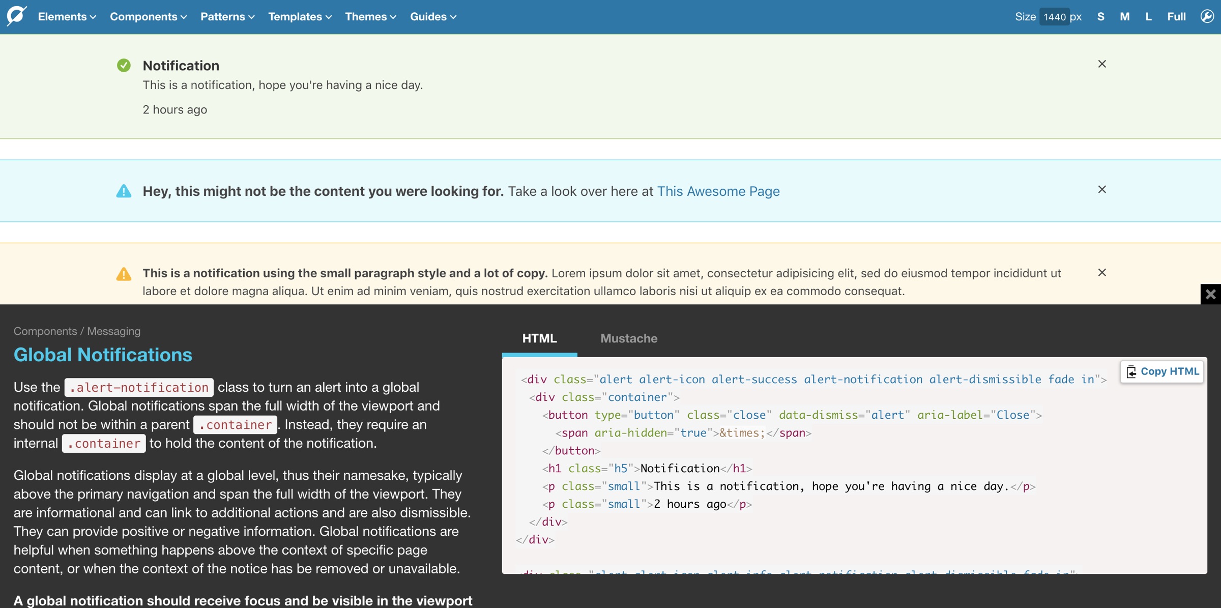
Today the Core Design System is the sum of three parts. The First is the Core Framework that includes the component library, documentation and development dependencies. Currently on the Node version of Pattern Lab, the site contains 100% production-ready styles, markup and functionality.
The second part is the Core Design Guidelines. This is where the atomic structure is flattened out for designers, authors and business owners in the form of a pattern library. Each pattern references live examples from the Core Framework and includes documentation with an overview, rules, constraints, principles, accessibility requirements, and class/configuration notes for authoring.
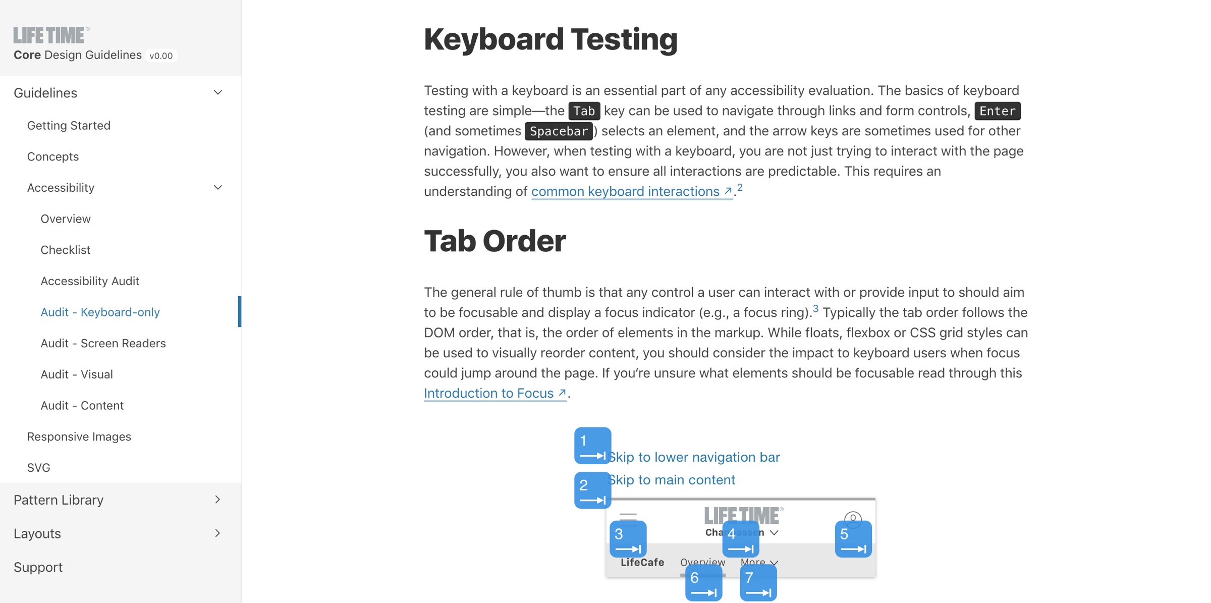
Within the guidelines there‘s sections that include our perspective on concepts like content strategy, performance, user experience, and accessibility. Lastly, guides are provided for some of our most common workflows.
The final section is the Core UI styleguide. This is the cloud-based Sketch library for all design assets needed to create new experiences.
Core now has full VP and department manager support. Multiple web properties and third-party integrations rely on its patterns and it is the go-to resource for our accessibility efforts. While we don’t have a dedicated design systems team, we have the beginnings of a solid federated team model(external link) with contributors from at least five teams. We also hold frequent training sessions between designers and developers—building upon the very relationships that laid the foundation at the start.